Turn your small business data into decisions with the right dashboard solution that fits your small business needs.

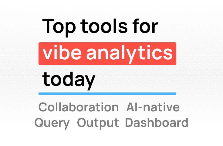
TL;DR: Collaborative analytics often creates noise instead of clarity. Scattered discussions across tools, conflicting metrics between teams, and no single source of truth. The solution requires three core elements: establishing governed metric definitions that everyone uses, integrating analytics into existing workflows rather than adding another tool to check, and keeping context visible alongside the data. When implemented intentionally around these pillars, collaborative analytics transforms from a source of confusion into a competitive advantage.
Slack threads filled with screenshot chains. Different teams are reporting different numbers for the same metric and spending more time reconciling metrics than acting on them: zero context, no reproducibility, no data lineage.
If this sounds familiar, you're not alone. It is a story we have seen numerous times: data teams, analysts, or, in some cases, founders, lose hours in spreadsheets to create a single slide deck. Data quality, complexity, and security all create a compounding effect that buries insights deeper and farther from decision makers.
The promise of collaborative analytics was supposed to solve this. Instead, many teams find themselves with more places to check for information, unanswered comments, discussions split across tools, and no clear source of truth. Research shows that analysts spend 10-11 hours per week just collecting and preparing data, with 76% still relying on spreadsheets for data cleaning.
The difference between collaborative analytics that creates clarity versus noise comes down to three core principles: establishing a single source of truth, integrating with existing workflows, and making context visible. Let's examine what creates noise, then explore how to create clarity instead.
Data analysts spend hours in Jupyter notebooks conducting exploratory data analysis, uncovering important patterns, and testing hypotheses. When they find something worth sharing, the process breaks down. Jupyter notebooks don't translate easily into shareable formats that non-technical stakeholders can understand. Analysts end up copying charts into slides, writing up findings in separate documents, or worse, just not sharing the work at all because the friction is too high.
This isolation means valuable insights stay trapped in individual workflows. An exploratory analysis that could spark strategic discussions never makes it beyond the data team. Feedback loops don't happen because sharing requires too much manual reformatting. The result is analysts working in silos, business teams making decisions without seeing the full picture, and a breakdown in the collaboration that makes analytics valuable.
When business teams are isolated from data, they don't know what questions they can ask. Product managers don't understand what customer behavior metrics are available. Marketing teams don't realize they could segment performance by acquisition channel. Operations leaders assume certain analyses aren't possible because they've never seen them.
This isolation creates friction and breaks down collaboration. Business stakeholders either don't ask questions at all, or they ask the wrong questions because they lack context about the data. Data teams spend time explaining what's possible instead of delivering insights. Decisions get made without data input simply because stakeholders don't know data could inform the decision.
The solution isn't training sessions on SQL, it's giving wider access to explore data within governed bounds. When non-technical team members can browse available metrics, see what dimensions they can filter by, and understand what questions the data can answer, their data literacy increases organically. This improved literacy directly enhances collaboration: better questions from stakeholders, fewer back-and-forth clarifications, and business teams that proactively use data instead of treating it as a separate department's responsibility.
When sales reports one churn number and finance reports another, when "active users" means something different to product versus marketing, and no one knows which dashboard is "official," you have a source-of-truth problem.
This happens because teams build dashboards independently, use different data sources for the same question, and lack central metric definitions. The cost shows up in time spent reconciling numbers instead of making decisions, erosion of trust in data, and delayed action while teams figure out "which number is right."
Charts exist in the BI tool. Commentary lives in Slack. Decisions get documented in Notion. Action items go into Jira. Email threads capture stakeholder feedback. No single place shows the full story.
This creates cognitive load as you try to piece together the full context, lost decisions and rationale, and new teammates who are always confused.
Effective collaborative analytics rests on three pillars that prevent noise while enabling speed.
You can't build a single source of truth on poorly modeled data. Metric inconsistencies come from how data is structured, not from lack of documentation. When teams build reports at different levels of detail or use inconsistent calculations, no documentation will solve the problem.
This means one definition per metric, governed and documented. Achievement requires a central metric repository, clear ownership per metric, automated validation against business logic, and version control for definitions.
Fix the foundation before adding more systems. Address how you structure and calculate metrics in your data warehouse before implementing semantic layers or metric repositories. When you build models that reflect how the business actually operates, consistent metrics emerge naturally rather than requiring enforcement.
Analytics platforms can only be as accurate as the underlying data structure. When your data is modeled at the right level of detail with metrics that combine safely, analytics and reporting can occur accurately. Without this foundation, calculations and EDA only amplify inconsistencies.
Insights and discussions must live where teams already work, not in yet another tool requiring login. This means connections to apps companies already use like GA4, Stripe, Google Ads, HubSpot and more, and native integrations with Slack, Google Sheets, email, automated report distribution, bi-directional sync where updates flow both ways, and no "check another tool" requirements.
When AI and automation are adequately integrated into workflows, the impact is significant: 86% of analysts say AI tool integration has improved their job satisfaction over the last year, with 41% reporting a particularly substantial difference. One customer specifically reached out to tell us that Fabi’s integration with multiple apps in their tech stack and the automated reports they push to Slack on a weekly basis has saved them 3 hours of work every week that they can put into acting on those insights rather than curating them.
Every insight needs to include assumptions, methodology, and interpretation. This requires inline commentary with version control, audit trails showing who changed what, attached narrative explaining significance, and linked decisions showing impact.
When context becomes visible, the efficiency paradox resolves. By maintaining context you improve trust and accuracy in your analytics leading to wider adoption and acceptance within the organization.
Understanding the three pillars of clarity, single source of truth, workflow integration, and visible context is essential, but implementation determines whether collaborative analytics succeeds or fails. The difference between platforms that create clarity and those that generate noise comes down to specific, tactical decisions about governance, adoption, and workflow design.
The challenge is that collaborative analytics represents a fundamental shift in how organizations approach data. Traditional BI tools treated data analysis as a specialized function performed by dedicated teams. Collaborative analytics democratizes this capability, which means you're not just deploying new technology, you're changing organizational behavior. Without intentional design, this democratization can fragment rather than unify, creating multiple versions of truth instead of a shared understanding.
The risk compounds because collaborative features naturally encourage participation. More people creating dashboards, more interpretations of metrics, more places for discussions. This participation is valuable only when it's structured. Unstructured collaboration amplifies existing problems: metric inconsistencies multiply, governance erodes, and the cognitive load of tracking conversations across platforms becomes unsustainable.
The opportunity lies in recognizing that clarity doesn't emerge from better technology alone. It emerges from designing systems that make the right behaviors easier than the wrong ones. When governed access is simpler than workarounds, when unified metrics are more accessible than custom calculations, when context travels automatically with data—that's when collaborative analytics transforms from a promising concept into a competitive advantage.
The following tips are organized around three critical themes: establishing data accuracy and trust, enabling workflow integration and adoption, and preventing noise while maintaining speed. Each addresses the structural design decisions that determine whether collaboration creates clarity or chaos.
Define metrics once, enforce everywhere
Create a single metric repository with:
This addresses the core problem of different teams reporting different numbers and eliminates the need for constant metric reconciliation.
Make assumptions explicit and governance accessible
When proper permissioning makes governed access easier than workarounds, shadow IT disappears. Research shows that 63% of analysts acknowledge that working outside governed systems delays projects due to the need for retroactive validation.
Meet teams where they work
Integrate analytics into existing tools:
Case study: Hologram integrated collaborative analytics directly into sales workflows and reduced analysis time by 94%, from a 1-2 day turnaround to 30 minutes during live sales calls.
Design for immediate adoption
When the tool is simpler than the workaround, adoption happens naturally. Parasail builds reports 10X faster than traditional BI tools.
Create guardrails, not gates
Balance governance with speed:
The solution isn't less governance, it's more innovative governance that enables rather than blocks.
Enable instant answers and automation
Technical requirements:
The speed difference is measurable: Aisle cut pilot evaluation time from 2-3 weeks to hours.
Build narrative and automate distribution
Lula Commerce eliminated 30 hours per week of manual data work. This is collaborative analytics working as it should: insights flow to people, not the other way around.
Collaborative analytics creates clarity by reducing friction and establishing a shared understanding. It creates noise by adding complexity and fragmenting context.
The questions to ask before implementing:
The measurable difference shows up in time from question to decision, consistency of metrics across teams, reduction in reconciliation time, increase in self-service adoption, and decrease in analyst backlog.
Collaborative analytics that create clarity also elevate the analyst role itself. Research shows that 94% of data analysts agree their role impacts strategic decision-making, and 87% say their influence on business decisions has increased in the past year. When analysts spend less time on data preparation and more time on insight generation, everyone benefits.
The organizations winning with data aren't the ones with the most tools. They're the ones that created clarity from chaos by intentionally designing their collaborative analytics around these principles:
Research shows 97% of analysts want governed self-service platforms, and 93% believe an all-in-one platform would significantly boost productivity. Furthermore, 90% believe AI will facilitate the growth of their career, with 48% expecting it to drive significant opportunities for advancement. The question isn't whether to implement collaborative analytics, but whether you'll do it in a way that creates clarity or just adds to the noise.
When implemented with intention around these three pillars, collaborative analytics transforms from a nice-to-have feature into a competitive advantage, reducing analysis time by 75-94%, eliminating request backlogs, and enabling organizations to move from question to insight to decision at the speed their market demands. As 86% of analysts report, their work leads to cost efficiencies, improvements in business processes, and better financial planning decisions. The tools you give them determine whether they can deliver on that potential.